Adding a Heart Rate Monitor
How one new sensor triggered a cascade of changes across Bluetooth, UX, settings, and data persistence — and why the pre-session screen had to be redesigned.
Adding a heart rate monitor to Step FWD sounded like a contained feature. Read BPM from a Bluetooth strap, show it on screen, save it with the session. A week of work, maybe.
It wasn’t. One new sensor triggered a cascade that touched almost every layer of the app: a CoreBluetooth service, a device pairing flow, a settings screen, a redesigned pre-session sheet, a floating map overlay, new fields on the data model, and changes to session persistence. This is the story of that cascade — and the design decisions we made along the way.
Why Bluetooth, not HealthKit
HealthKit can read heart rate data. It aggregates readings from Apple Watch, Bluetooth devices, and other sources into a unified health store. It’s what we use for step counting, and it works well for that.
But HealthKit batches heart rate updates. Depending on the source device and iOS’s sync schedule, readings can lag by 30 seconds to several minutes. For step counts — where you’re looking at a cumulative daily total — that lag is invisible. For heart rate — where you want to see your BPM change as you pick up pace — it’s unusable.
We went with CoreBluetooth and the standard BLE Heart Rate Profile (UUID 0x180D). This gives us direct device-to-device communication. The heart rate strap broadcasts a BLE advertisement, the iPhone subscribes to the Heart Rate Measurement characteristic (0x2A37), and BPM updates arrive in near-real-time. No intermediary, no batching, no lag.
There’s a privacy bonus here too. The data flows directly from the strap to the phone over Bluetooth. No cloud relay, no server, no third-party SDK processing your heart rate. It’s consistent with our on-device architecture — your heart rate data never leaves your phone.
The pairing flow
Before you can read heart rate data, you need to find and connect to a device. This is where Bluetooth gets messy if you’re not careful.
Our scan filters exclusively for devices advertising the Heart Rate Service UUID. This is important — without filtering, you’d see every Bluetooth device in range: headphones, speakers, keyboards, your neighbor’s smart lock. Filtering by service UUID means the scan results only show devices that actually broadcast heart rate data.
Each discovered device shows its name and signal strength, visualized as a 3-bar indicator (strong above -60 dBm, good above -80 dBm, weak below). This matters in practice — if you’re in a gym with multiple people wearing WHOOP straps, signal strength helps you identify which one is yours.
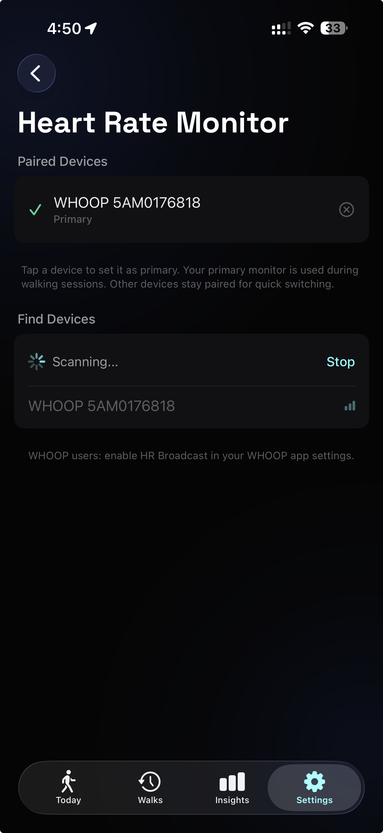
Tap a discovered device to pair it. The first device you add is automatically marked as your primary — the one that gets used during walking sessions. You can pair multiple devices (maybe a chest strap for serious walks and a wrist band for casual ones), but only one is primary at any time.
This primary device concept is inspired by Hick’s Law — decision time increases logarithmically with the number of choices. By designating a primary, we reduce the choice at session start to zero. You don’t pick a device before each walk. The app auto-reconnects to your primary when you open the session setup. One less decision between you and the door.
Redesigning the pre-session screen
This is where the real complexity lived. The pre-session sheet already showed GPS signal status, goal type selection, a target adjuster with presets, a “complete daily goal” shortcut, and a back-and-return toggle. It worked. Then we needed to add heart rate connection status somewhere — device name, BPM, connection state — without making the screen feel overloaded.
The first attempt was obvious: add an HR indicator next to the GPS signal. It fit physically, but the screen started feeling cluttered. Two status indicators, three goal cards, a big number, preset pills, a daily goal chip, a back-and-return toggle, a start button. Too many things competing for attention at a glance.
Part of the fix was the overall restructuring, but we also toned down individual elements. The “complete daily goal” chip, for example, used to compete visually with the preset pills and goal cards. We redesigned it to feel less like a button and more like a contextual suggestion — lower contrast, smaller footprint — so it flows naturally into the target selection area instead of fighting for dominance.
We stepped back and restructured the entire screen around a 3-tier information hierarchy, drawing on progressive disclosure — the principle that interfaces should show only what’s essential at each moment and defer the rest.
Tier 1: Ambient status strip. GPS signal and heart rate connection sit at the top as quiet indicators. They’re present, readable if you look, but not demanding attention. This follows Mark Weiser and John Seely Brown’s concept of calm technology:
“Information that informs but doesn’t demand our focus.”
Your WHOOP is connected at 61 BPM. Good. Your eyes move on.
Tier 2: Goal configuration. This is why you opened this screen — to decide what kind of walk you’re about to take. Goal type cards, the big target number, presets, and the daily goal chip. This tier gets the visual weight and the central position.
Tier 3: Collapsible session settings. Back-and-return toggle and other per-session options. Before this redesign, the back-and-return option sat directly in the sheet — visible but competing for space. We moved it behind a disclosure button as part of the restructuring. Most walks, you don’t touch this. It doesn’t need to be on screen by default.
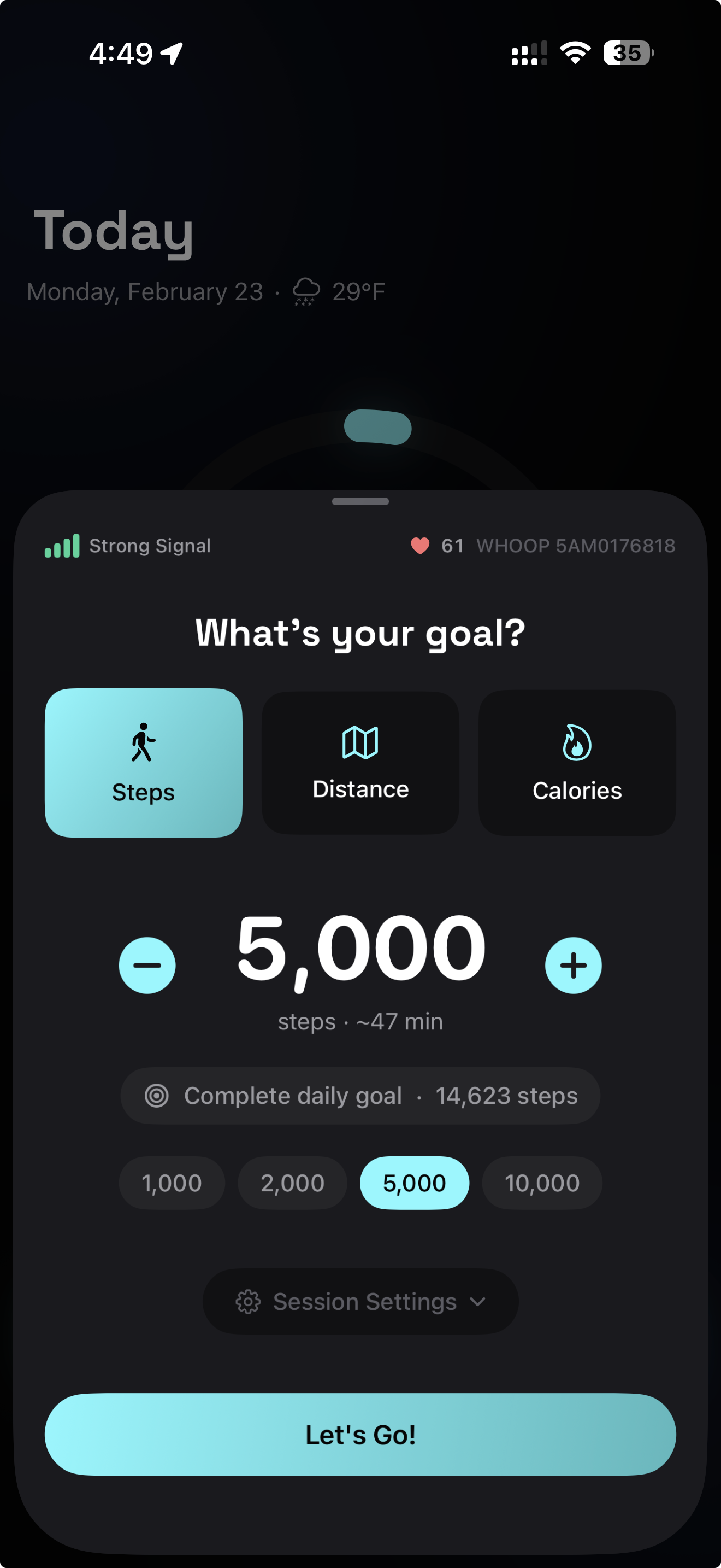
The result is a screen where each tier serves a distinct cognitive purpose. Miller’s Law suggests our working memory handles roughly seven chunks of information — by organizing into three clear tiers rather than twelve scattered elements, we keep the screen scannable even with the new HR data.
We also made the sheet height dynamic — 640 points when settings are collapsed, 700 when expanded — so the layout breathes naturally without dead space or cramping.
Live BPM during the walk
Once the session starts, heart rate moves from the setup sheet to the active session screen. This was another screen that needed rethinking — not just to fit HR, but because the bottom panel had accumulated clutter of its own.
The old layout had a problem: depending on your goal type, one metric was always duplicated. If your goal was steps, the goal progress showed steps and the stats row showed steps again. The “today’s total vs. daily goal” indicator floated awkwardly between the stats row and the controls, not quite belonging to either.
We cleaned this up. The stats row now shows only non-redundant metrics — distance, calories, and your today-vs-daily-goal progress, which moved into the stats row where it’s more visible and contextually obvious. Icons sit to the left of their values with color coding, and the text is bigger. By removing duplication, we actually gained space while making each metric easier to read. The panel is simpler and more scannable than before the heart rate feature existed.
With that breathing room, adding the live BPM was straightforward. We went with a small floating overlay on the right side of the map. A dark translucent card showing a heart icon and the current BPM. That’s it.
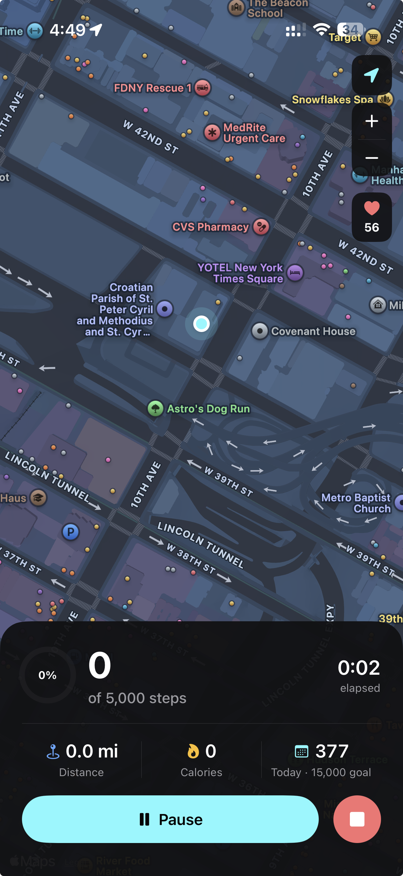
The heart icon pulses — a subtle scale animation from 1.0x to 1.12x over 120 milliseconds, repeating every 1.3 seconds. It’s enough to register as “alive” in your peripheral vision without pulling focus from the map or your metrics. When the device disconnects, the icon turns gray and shows a dash. When it reconnects, it resumes pulsing. No alert, no modal, no interruption.
This is calm technology again. The BPM is there when you want it. When you don’t, it sits quietly at the edge of the map.
The 10-second grace period
Bluetooth Low Energy is not a cable. Signal drops happen — you walk past a metal structure, your arm swings at an angle that briefly shields the antenna, a burst of 2.4 GHz interference hits. These are transient interruptions, usually lasting a second or two.
Without a grace period, each drop would flash a “Disconnected” state, then immediately flip back to “Connected” when the signal returns. That flickering is worse than no indicator at all — it erodes trust in the feature.
We added a 10-second grace period. When the BLE connection drops, the system immediately attempts reconnection in the background. If the device comes back within 10 seconds, the user never sees a state change. Their BPM keeps updating as if nothing happened. Only after 10 seconds of sustained disconnection does the UI show the disconnected state.
This follows Nielsen’s error prevention heuristic — the best error message is the one you never have to show. Brief BLE drops are a hardware reality, not a user-facing event.
Data persistence
Every heart rate reading during a session is captured as a sample — BPM value and timestamp. These accumulate in memory during the walk. When the session ends, average and max heart rate are computed from the sample array, and the entire sample set is JSON-encoded and stored alongside the session in SwiftData.
Storing per-sample data (rather than just the average) means we can later build features on top of it — heart rate charts over the walk duration, zone analysis, correlation with pace changes. The raw data is there, on-device, whenever we’re ready to use it.
On pause, heart rate monitoring stops. On resume, it restarts and samples continue accumulating. The pause/resume boundary is clean — no phantom readings during rest periods, no gaps in the data when you start moving again.
What one feature actually costs
The heart rate monitor touched seven areas of the codebase: a new CoreBluetooth service with BLE scanning, connection management, and characteristic parsing. A settings view with a state machine for scan/connect/pair flows. A view model for device management. Changes to the session view model for monitoring lifecycle. A new floating overlay component. Three new fields on the data model. And a full redesign of the pre-session screen’s information architecture.
That’s the real cost of “add heart rate support.” Not the Bluetooth code — that’s well-documented and follows a standard BLE profile. The cost is in the UX cascade. Every new piece of information needs a place to live, and every place it could live is already occupied by something that earned its spot. The engineering challenge isn’t connecting to a heart rate strap. It’s keeping the app simple after you do.