Redesigning How You Review a Walk
How adding heart rate stats to session recaps triggered a full redesign of the walk detail screen — informed by competitive analysis of Strava, Apple Fitness, Nike Run Club, and Garmin.
We shipped the heart rate monitor last week. BLE pairing, live BPM during walks, data persistence — all working. Then we opened the session complete screen and realized the numbers just… sat there. Two plain text rows — “Avg Heart Rate: 118 BPM” and “Max Heart Rate: 142 BPM” — buried in a flat list of summary rows next to distance, calories, and duration.
Heart rate data tells a story. It rises when you climb a hill, settles into a rhythm on a flat stretch, spikes when you pick up pace. Two numbers can’t tell that story. We needed a chart. And the moment we tried to add a chart to the existing layout, the whole screen fell apart.
This is how a heart rate chart turned into a full redesign of three screens.
Research first
Before touching any code, we studied how five major apps present post-activity data: Strava, Apple Fitness, Nike Run Club, Garmin Connect, and AllTrails. The research revealed clear patterns across all five.
Every app uses a hero number. Nike Run Club makes distance unmissable — enormous, center-aligned, impossible to ignore. Apple Fitness leads with total time. Strava gives distance the largest treatment in its summary panel. Only Garmin avoids the hero pattern, opting for a data-dense dashboard where every metric gets equal weight. The pattern is clear: one number anchors the view, and everything else orbits around it.
Map placement is split. Strava, Garmin, and AllTrails put the map at the top — “where did you go?” is the first question they answer. Apple Fitness and Nike Run Club lead with numbers — “what did you achieve?” comes first. For a walking app, we felt both approaches had merit, but spatial context matters for walkers. You want to see your route.
Progressive disclosure is universal. No app dumps everything on screen at once. Every single one uses some form of “show more” — collapsible sections, tabs, progressive reveal. Strava does it with expandable panels. Apple Fitness uses per-section disclosure. This is a well-established pattern backed by information foraging theory — users follow information scent, scanning cues to decide whether to engage deeper.
Heart rate sits below the primary stats. Across all apps, HR charts live in the analysis section — positioned after the key metrics. Apple Fitness is the exception, placing HR closer to the top, reflecting its health-first philosophy. But even Apple tucks the full chart behind a “Show More” tap.
The old layout
The session complete screen was a flat list. A checkmark icon at the top, then SummaryRow after SummaryRow: duration, steps, distance, calories, average heart rate, max heart rate. A separate card showed whether you hit your goal. Below that, a 300-point tall map.
Three problems:
Redundancy. If your goal was steps, the goal card showed your step count and the summary list showed your step count. One metric always appeared twice, depending on goal type. That violates a basic principle from Edward Tufte — every element on screen should carry unique information. Redundant data-ink dilutes the signal.
No hierarchy. Every row had the same visual weight. Duration looked the same as calories looked the same as heart rate. Your eyes had no anchor — nowhere to land first. Research on visual hierarchy shows that users scan screens in predictable patterns, and a clear size/weight hierarchy guides that scan. Without one, users have to read everything to find what matters.
No story in the heart rate. Two numbers — average and max — are the least interesting way to present temporal data. You can’t see the hill you climbed, the warm-up phase, the cooldown. Heart rate data is a timeline, and timelines need charts.
The new hierarchy
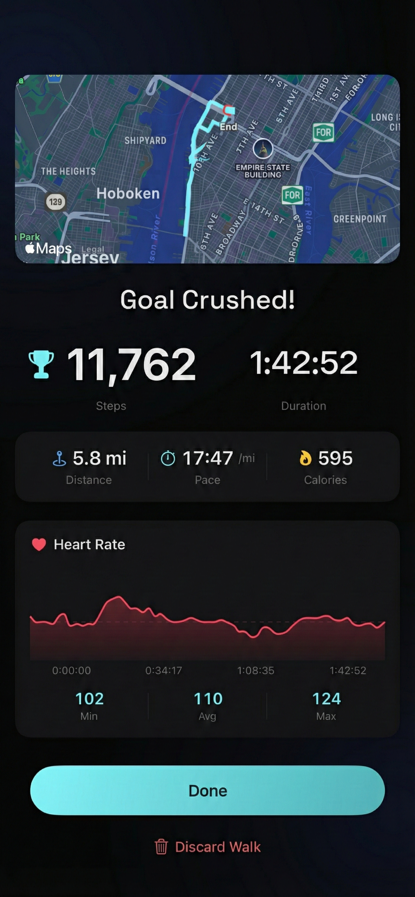
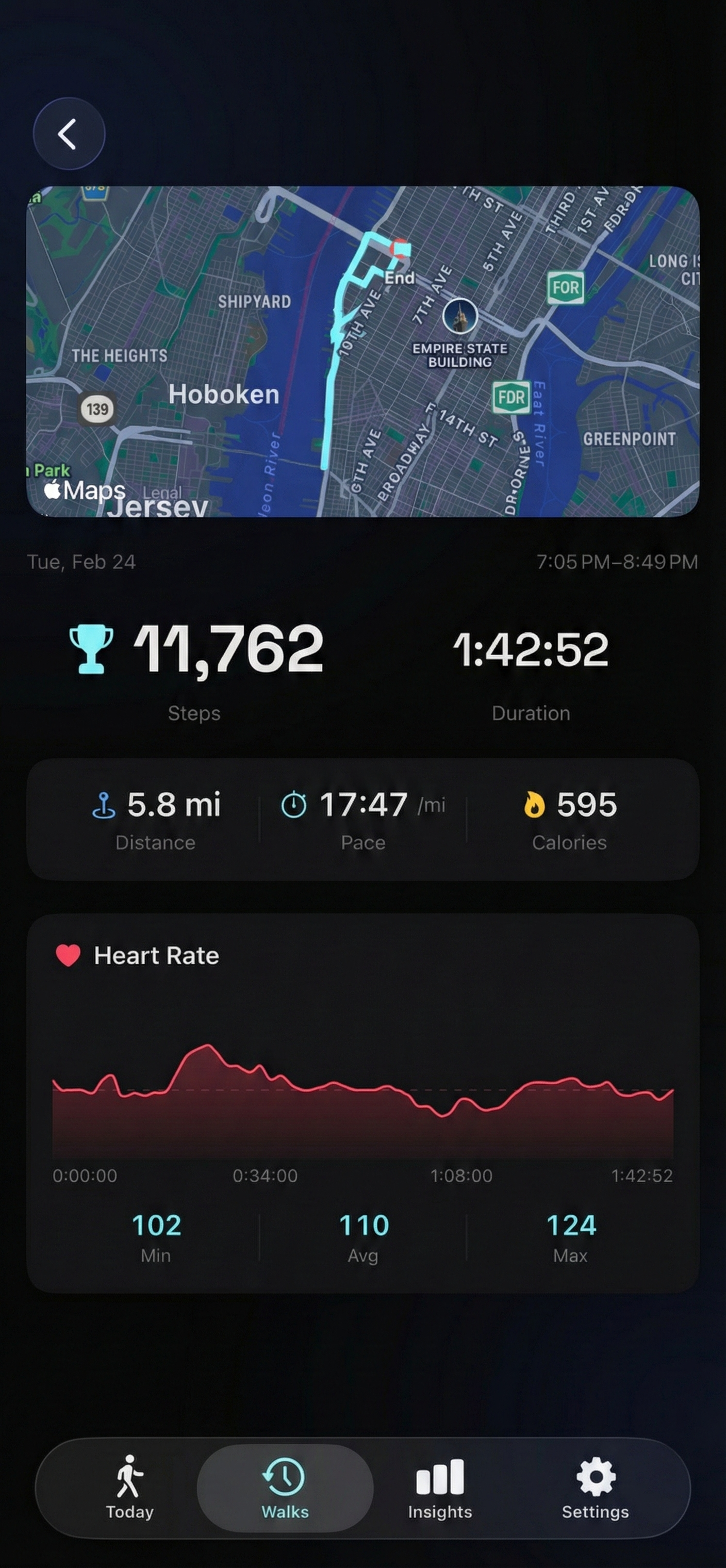
We restructured around a clear visual hierarchy with four layers. Everything fits on a single screen — no scrolling required. The ordering does the work: your eye moves naturally from spatial context to achievement to supporting data to the heart rate story.
Layer 1: Route map. Compact (200 points, down from 300) but positioned at the very top. For walkers, “where did I go?” is often more interesting than raw numbers. A quick spatial anchor before the data.
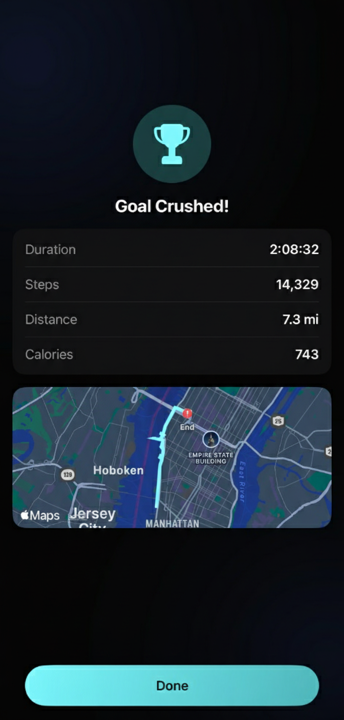
Layer 2: Hero metric + duration. The goal metric — whatever you were walking toward — gets the hero treatment. Steps in a 40-point Space Grotesk heading. Or distance. Or calories. Whichever you chose as your goal, that’s your number. Duration sits beside it, slightly smaller, baseline-aligned. When you hit your goal, a trophy icon appears inline — not in a separate card, not as a banner, just a quiet symbol next to your number.
This is the Nike Run Club insight applied to walking: one number dominates. Your eye lands there. You know immediately what you achieved.
Layer 3: Stat grid. A 3-column grid showing the remaining metrics — the ones that aren’t your hero number. If your goal was steps, the grid shows distance, pace, and calories. If distance, it shows steps, pace, and calories. No redundancy. Each metric has a colored icon matching the active session screen, creating visual consistency across the app — what you see during the walk is what you see after.
Layer 4: Heart rate chart. A gradient area chart with an interactive scrubber. This is the story layer — the one that rewards engagement. Drag across the chart to see your BPM at any point during the walk, with the elapsed time shown above. Below the chart, three reference numbers: min, average, and max.
The interactive heart rate chart
The chart needed to handle a practical constraint: a two-hour walk generates roughly 6,500 heart rate samples. Rendering all of them in a SwiftUI chart would be expensive and visually noisy.
We downsample to 60 points using a linear stride through the original dataset, always preserving the first and last samples for temporal accuracy. The visual smoothing comes from Catmull-Rom interpolation on the line — a spline that passes through each data point while creating smooth curves between them. The result looks natural, not jagged, even with 100x fewer points.
The chart renders as two layers: an area fill with a gradient fading from 30% opacity at the top to near-transparent at the bottom, and a 2-point line on top in the heart rate accent color. A dashed horizontal rule marks the average — a reference line your eye can compare the curve against.
The scrubber is a drag gesture overlay that finds the nearest data point using binary search. When you touch and drag, a vertical line follows your finger with a small red dot marking the exact BPM value. The header updates in real-time to show the BPM and elapsed time at that point.
This follows Ben Shneiderman’s Visual Information-Seeking Mantra: overview first (the full chart), then details on demand (the scrubber). You see the shape of your walk at a glance. If something looks interesting — a spike, a plateau, a gradual climb — you can drag to investigate.
A performance note: the chart itself is wrapped in an Equatable struct. This prevents SwiftUI from re-rendering the chart path on every frame during a drag — only the lightweight scrubber overlay updates. The result is buttery-smooth interaction even on long walks.
Consistency across screens
The same visual language now flows across three screens:
Session complete (the recap you see right after finishing a walk) uses the same hero metric + stat grid + HR chart layout, but with slightly larger typography — 48-point heading instead of 40 — because it’s a moment of celebration. The map sits at the top, and a “Goal Crushed!” or “Walk Complete” title sets the tone.
Walk detail (when you tap a past walk from your history) mirrors the session complete structure exactly. Same hierarchy, same components, same stat grid. The only difference is context — you’re reviewing rather than celebrating.
Walk cards (the list items in your walks history) are compact teasers: route snapshot, a centered hero number at 24 points, and a single secondary line — “35:00 · 2.5 mi · 118 BPM” — with dot separators. Enough to identify and compare walks at a glance, with the full detail a tap away.
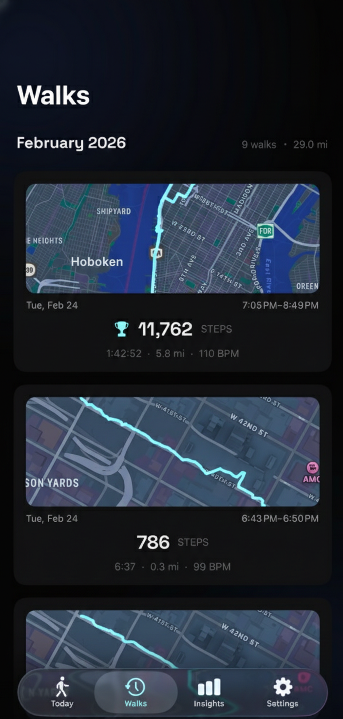
This internal consistency — using the same icon + metric pairings, the same font hierarchy, the same layout logic across session, recap, detail, and card — means users learn the visual language once. The colored distance icon in the active session is the same colored distance icon in the stat grid, which is the same icon in the walk card. No relearning between contexts.
What we removed
The redesign deleted more than it added:
- SummaryRow component — the flat label:value row used everywhere. Gone entirely. Replaced by the hero metric + stat grid pattern.
- Separate goal status card — the standalone card that showed whether you hit your goal. The trophy icon inline with the hero number communicates the same information in less space.
- Redundant metrics — the goal metric no longer appears twice. The stat grid explicitly skips whatever metric is already shown as the hero number.
- Oversized map — 300 points was generous. 200 points provides spatial context without dominating the screen.
We also switched the dashboard’s step count to Space Grotesk — the same font used for hero numbers throughout the app. A small change, but it means the number inside your daily progress ring speaks the same typographic language as every other important number in Step FWD.
The real lesson
Adding heart rate stats to the session recap was a feature request. Redesigning three screens was not. But the moment we tried to wedge a chart into a flat list, the flat list revealed itself as the real problem. Every new piece of information you add to a bad layout makes the layout worse. The chart was the forcing function, but the hierarchy was the fix.
The competitive research gave us confidence that the hero metric pattern works — it’s battle-tested across every major fitness app. The specifics are ours: which metric gets the hero treatment (goal-based, not always distance), how the stat grid adapts (skipping the hero metric to avoid redundancy), where the map sits (top, compact, spatial anchor). But the structure — anchor, support, detail, story — is a shared vocabulary across the industry for a reason. It maps to how people actually process information: the big picture first, then the numbers, then the narrative.