Custom Navigation with Variable Blur
How we replaced UINavigationBar with a branded header system using progressive blur, dark gradients, and layered shadows — and why the stock navigation bar wasn't enough.
The stock UINavigationBar is functional but invisible. Every iOS app looks the same at the top — a system-provided bar with a back chevron, a title, and a translucent material. It’s competent. It’s also forgettable. For an app built around calm, intentional walking, the navigation should feel as considered as the rest of the experience.
One afternoon we replaced it entirely.
Why not UIVisualEffectView?
Apple’s blur API gives you uniform blur: every pixel blurred by the same radius. Set the style to .systemUltraThinMaterial and you get a flat, consistent frosted-glass effect across the entire view. This creates a hard visual edge where blurred meets sharp — a clean line that says “here is where the navigation bar ends and your content begins.”
Apple’s own apps don’t do this. The App Store, Maps, and visionOS interfaces use progressive blur — a smooth gradient where the blur radius fades from full strength at the top to zero further down. The boundary dissolves instead of cutting. But Apple doesn’t expose this API publicly. As Devs Love Coffee documented, single-pass uniform blur also produces “bloom” artifacts at high radii — bright pixels bleeding outward and creating halos around high-contrast edges. Progressive blur sidesteps this by applying strong blur only where it’s needed.
Variable blur with CAFilter
The solution lives in Core Animation’s private API. CAFilter with type "variableBlur" accepts a gradient mask image that determines the blur radius per pixel. Where the mask’s alpha is 1.0, the blur is at full strength. Where it’s 0.0, there’s no blur at all. Feed it a smooth vertical gradient and you get a smooth transition from blurred to sharp — no hard edge, no bloom.
This approach was pioneered in the open-source community by developers like nikstar, building on techniques explored by jtrivedi and aheze. Some developers have shipped this in App Store apps by obfuscating the private API strings — CAFilter itself is undocumented and technically falls under Apple’s private API restrictions.
This is a conscious trade-off. Private APIs can break between iOS versions. Apple could reject an app update that uses them. We accepted the risk for two reasons: the technique is widely used in production apps, and the visual difference between uniform and progressive blur is dramatic enough to justify the maintenance cost. If Apple ships a public progressive blur API tomorrow, we’ll switch. Until then, CAFilter does what UIVisualEffectView can’t.
The layering stack
The blurred header isn’t just a blur — it’s four layers, each solving a specific problem.
Layer 1: VariableBlurView. The progressive blur creates depth separation between the header zone and the scrollable content. As Nick Babich wrote for Smashing Magazine, blur signals z-axis position in flat interfaces — blurred elements read as “behind” or “above” sharp elements, giving the brain a depth cue without drop shadows or elevation changes. Apple’s own Human Interface Guidelines on Materials describe this as creating “a sense of depth, layering, and hierarchy.”
Layer 2: Dark gradient overlay. A linear gradient from near-black at the top to transparent below. This ensures text remains legible regardless of what content scrolls behind the header. A bright map tile or a white chart bar could wash out white text without this contrast layer.
Layer 3: Layered drop shadows. Two shadows stacked — a tight, dark shadow close to the text for crispness, and a larger, softer shadow for ambient separation. This dual-shadow technique gives text a sense of floating above the blur without looking like it has a visible stroke or border.
Layer 4: Text. The title and navigation controls sit on top, rendered in the app’s brand font with consistent sizing and spacing.
Each layer is invisible on its own. Together they create a header that feels like it belongs to the environment rather than sitting on top of it.
A composable header system
The visual treatment is consistent, but the header content changes depending on context. Rather than duplicating styling across screens, we built two components and one modifier.
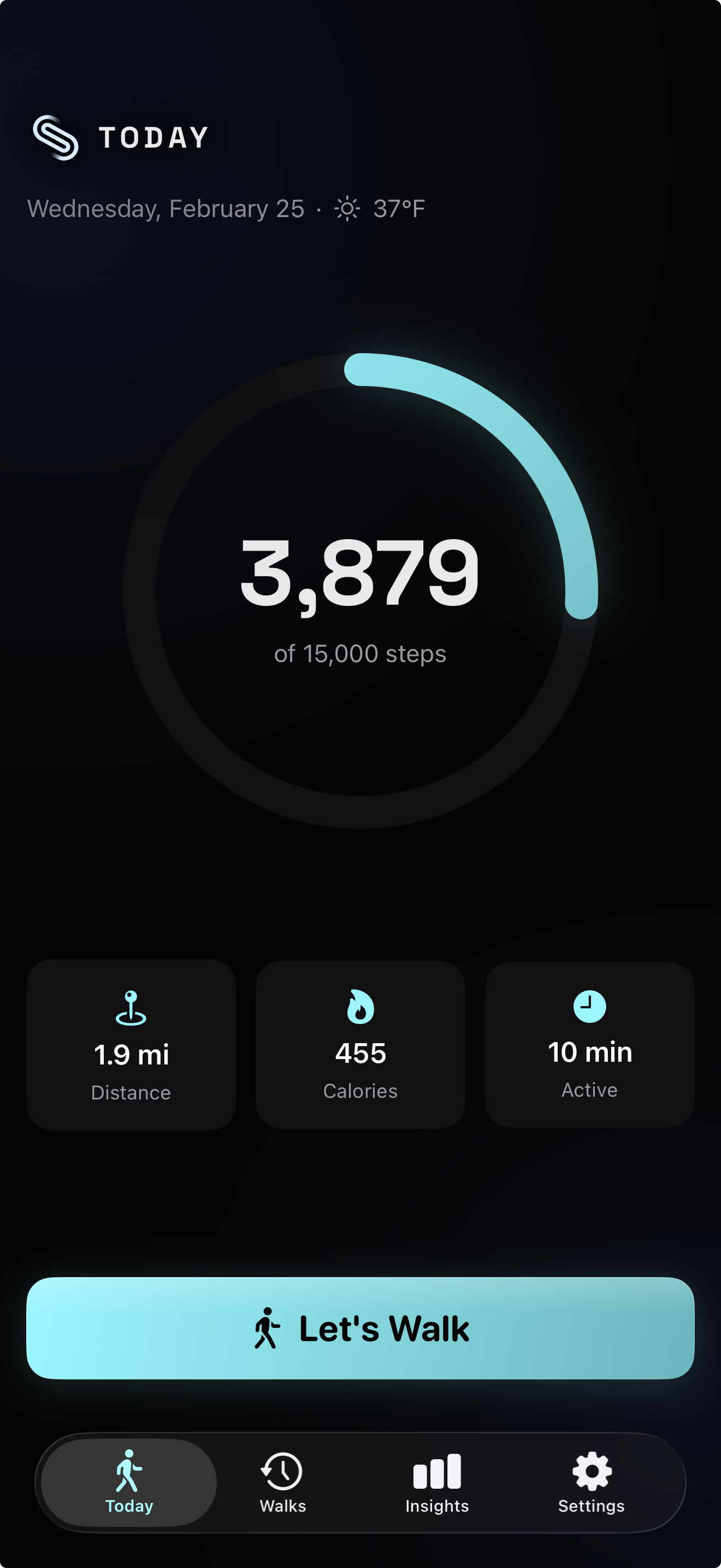
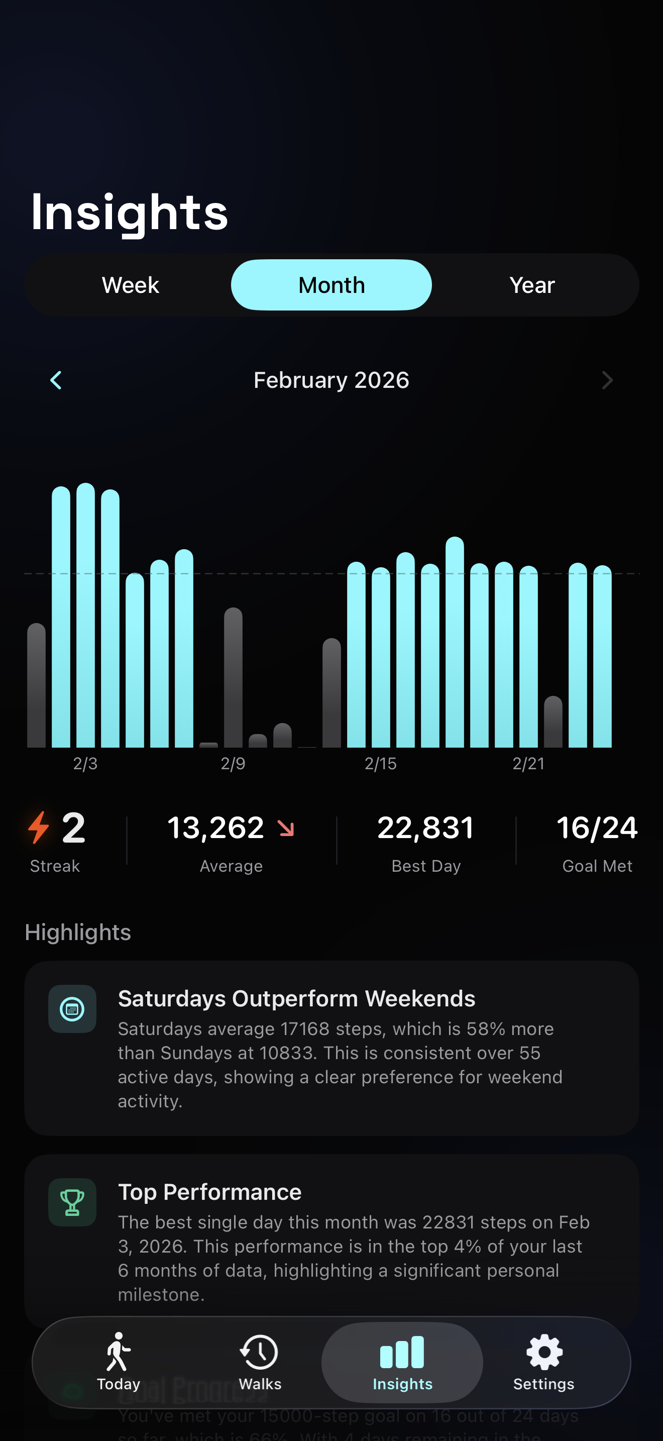
AppHeader renders the logo and an uppercased title. It’s used on root tab screens — Walks, Dashboard, Settings. The logo anchors the brand identity on every top-level destination.
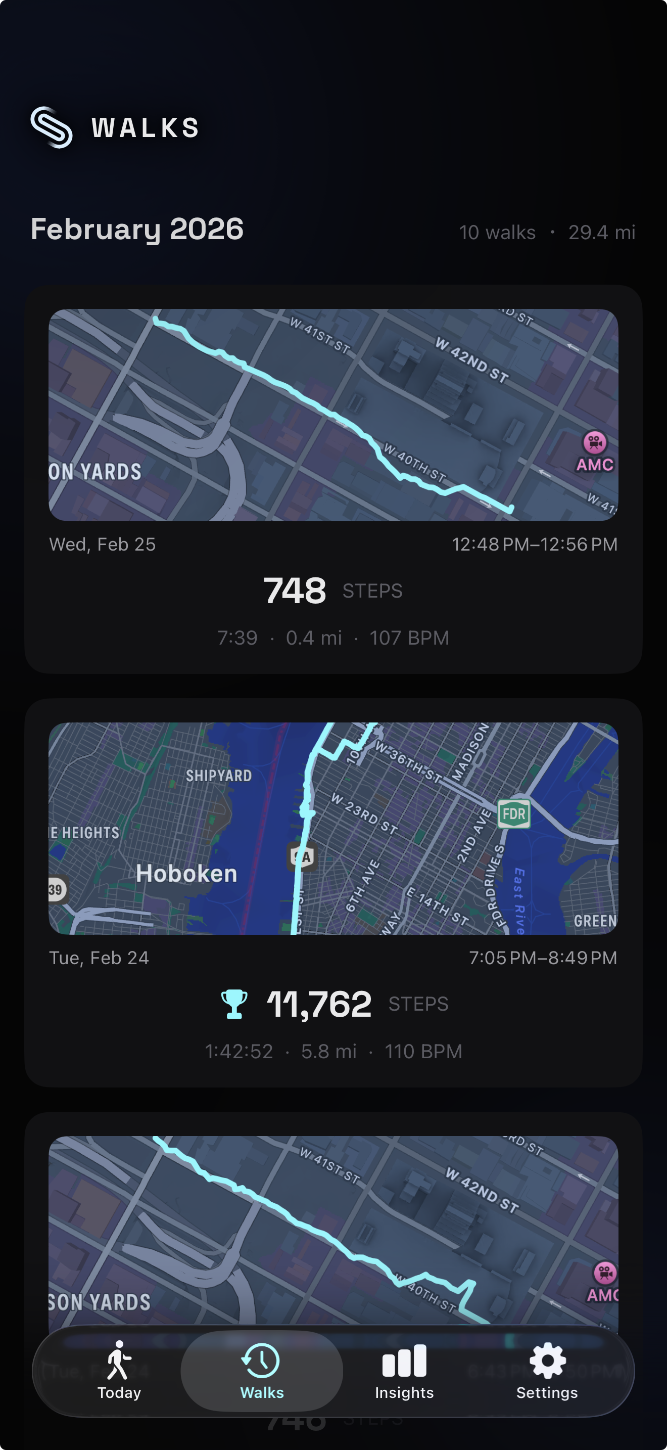
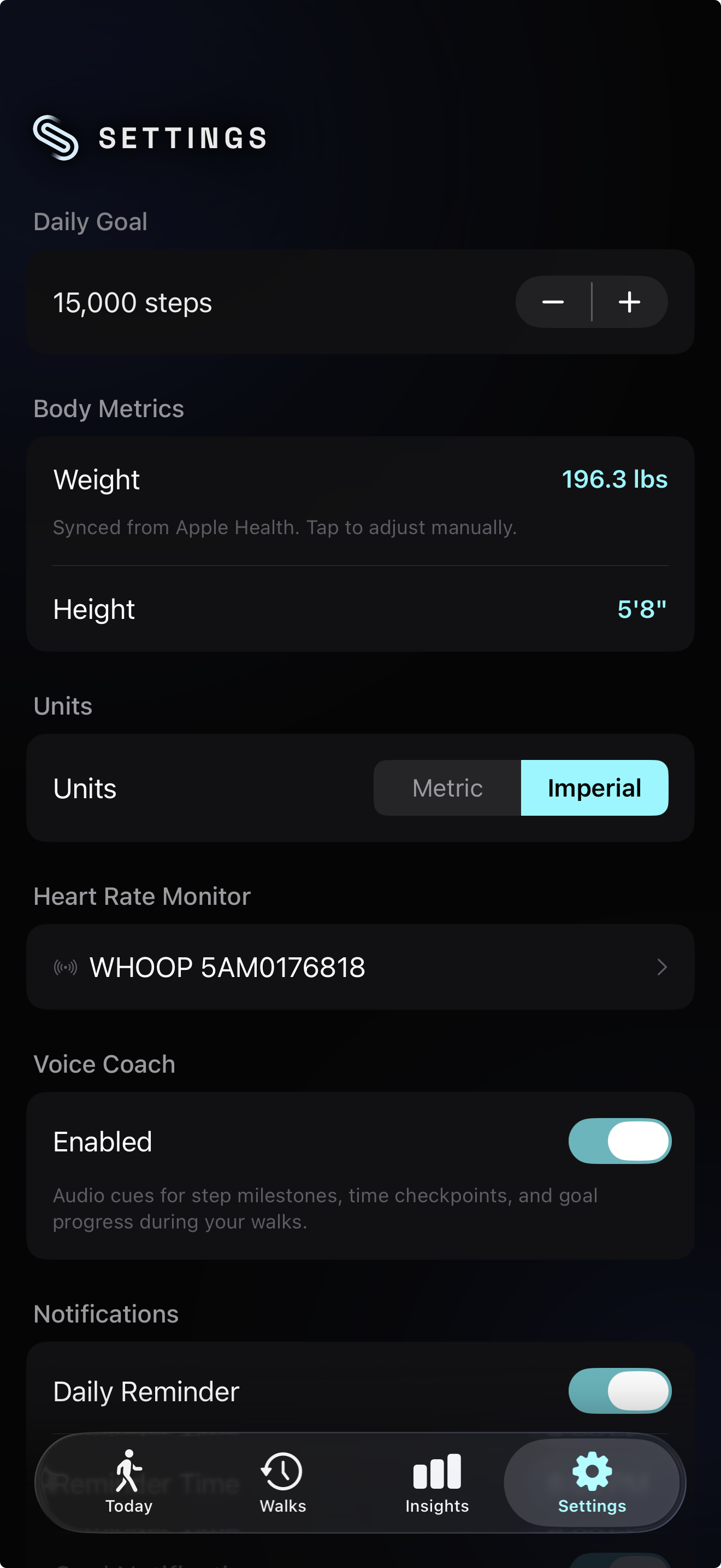
DetailHeader renders a back chevron, a title, and a trailing logo. It’s used on pushed screens — walk detail, settings subpages, devlog entries. The chevron provides a clear escape hatch, and the trailing logo maintains brand presence without dominating.
HeaderStyle is a SwiftUI ViewModifier that encapsulates the entire visual stack — the variable blur, the gradient overlay, the shadows, the safe area handling. Both AppHeader and DetailHeader apply this modifier. It’s the single source of truth for how the header looks. Change the blur radius, the gradient stops, or the shadow values in one place and every screen updates.
This follows Nielsen’s Consistency and Standards heuristic:
“Users should not have to wonder whether different words, situations, or actions mean the same thing.”
The same visual treatment on every screen builds mastery. After two or three navigations, users stop noticing the header entirely. They just know where they are.

Before and after
The transformation is immediately visible. The stock navigation bar is technically correct — it has a title, it has a back button, it handles safe areas. But it looks like every other app on the phone.
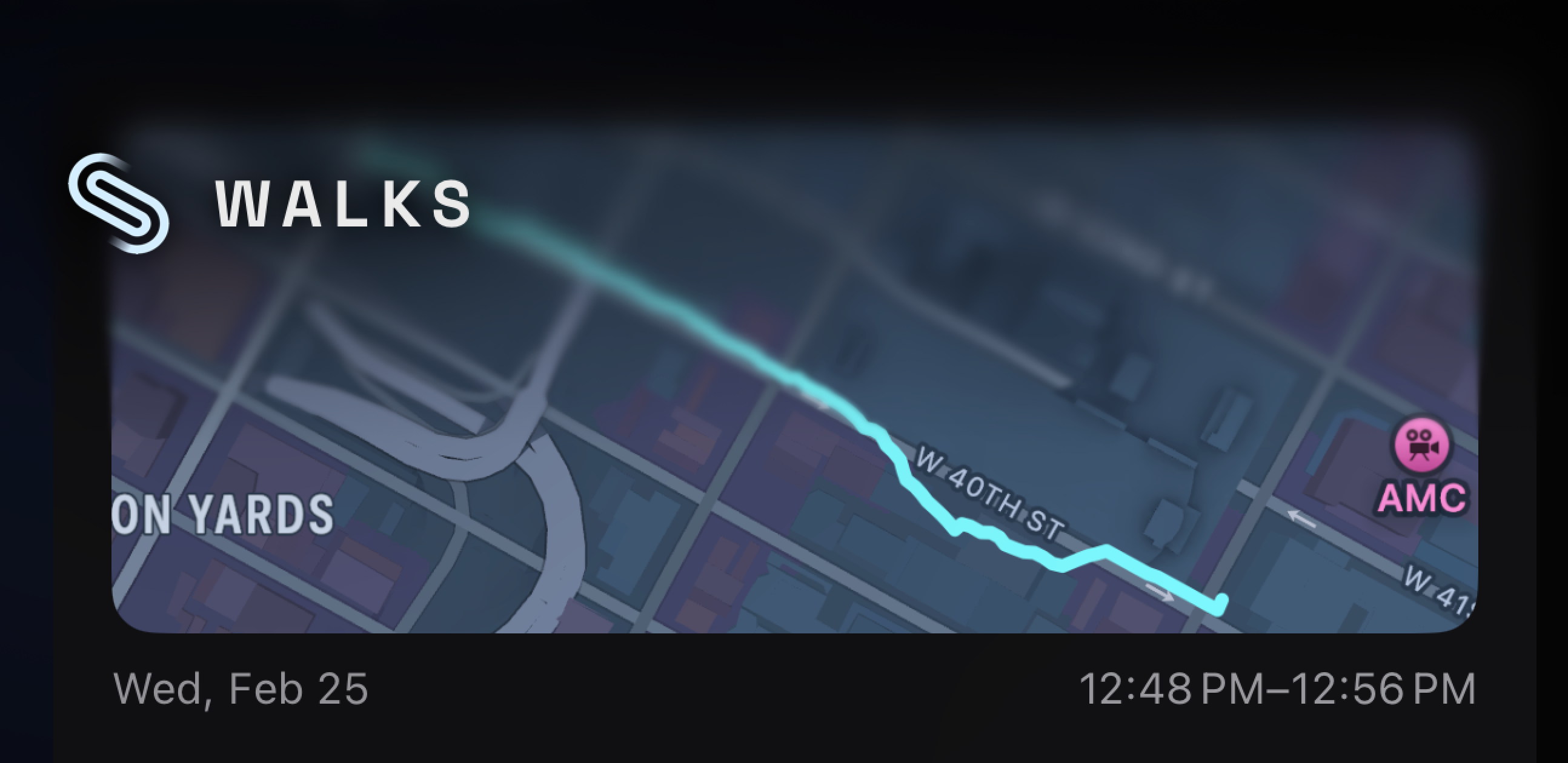
The blur in action
The progressive blur earns its keep when content scrolls. Chart bars, map tiles, and text all pass behind the header zone. With uniform blur, you’d see a hard line where content transitions from sharp to frosted. With progressive blur, the transition is gradual — content fades smoothly into the blurred region, and your eye doesn’t register a boundary at all.
The close-up tells the story. There’s no edge. The blur radius increases pixel by pixel according to the gradient mask. Content 30 points below the header is fully sharp. Content at the header boundary is partially blurred. Content behind the header text is fully blurred. The transition occupies maybe 20 points of vertical space — enough to be imperceptible at normal viewing distance.
Preserving native gestures
When you set .navigationBarHidden(true) in SwiftUI, you lose more than the visual bar. You also lose the interactive swipe-back gesture — the edge pan that lets you drag from the left edge to pop back to the previous screen. Users don’t think about this gesture until it’s gone, and then everything feels broken.
A 10-line SwipeBackGesture extension fixes this. It reaches into UINavigationController’s interactivePopGestureRecognizer and reattaches the delegate, restoring the system gesture even without a visible navigation bar. The gesture works identically to the stock behavior — drag from the left edge, see the previous screen peek in, release to complete or snap back to cancel.
Platform conventions matter. Custom chrome should never break fundamental navigation patterns. Users have years of muscle memory around the swipe-back gesture. Removing it to achieve a visual goal would be a poor trade.
The header as calm technology
Mark Weiser and John Seely Brown defined calm technology in 1996:
“Technology that informs but doesn’t demand.”
They introduced the concept of the “periphery” — what we are attuned to without attending to explicitly. A well-designed room has walls, a ceiling, ambient light. You don’t think about them. But they provide spatial grounding, a sense of enclosure and orientation.
The header operates in the periphery during active use. When you’re scrolling through your walk history or watching your step count climb during a session, the header isn’t the focus of attention. But it’s providing a constant brand signal and spatial grounding — you know where you are in the app without reading the title, because the visual language of the header (the logo placement, the blur, the gradient) is consistent and distinct from every other app on your phone.
The progressive blur makes the boundary soft. The transition between “I see the header” and “I’m reading content” is gradual, not binary. There’s no moment where your eye crosses a line. This connects to the Gestalt principle of common region — elements within the same bounded area are perceived as grouped. The blurred zone acts as a cognitive container grouping the navigation controls, even without a hard border. The blur is the border, and because it’s soft, the grouping feels natural rather than imposed.
What we learned
Custom navigation is a commitment. Every new screen needs to opt into the header system. Every pushed view needs a DetailHeader with the right title. Every root tab needs an AppHeader. If you add a new screen and forget, it looks jarring — the stock bar flashes for a frame before the custom header appears.
But when the header feels native to your brand rather than native to iOS, the app stops feeling like a template and starts feeling like a product. The blur, the gradient, the shadows, the consistent logo placement — none of these are features a user would list if you asked them what they like about the app. They’re periphery. They’re the walls of the room. And that’s exactly where they should be.