Visualizing Pace Data
How we built a pace chart from noisy GPS samples using a two-stage smoothing pipeline, reversed the Y-axis so faster feels higher, and synced scrubbers across charts for multi-metric correlation.
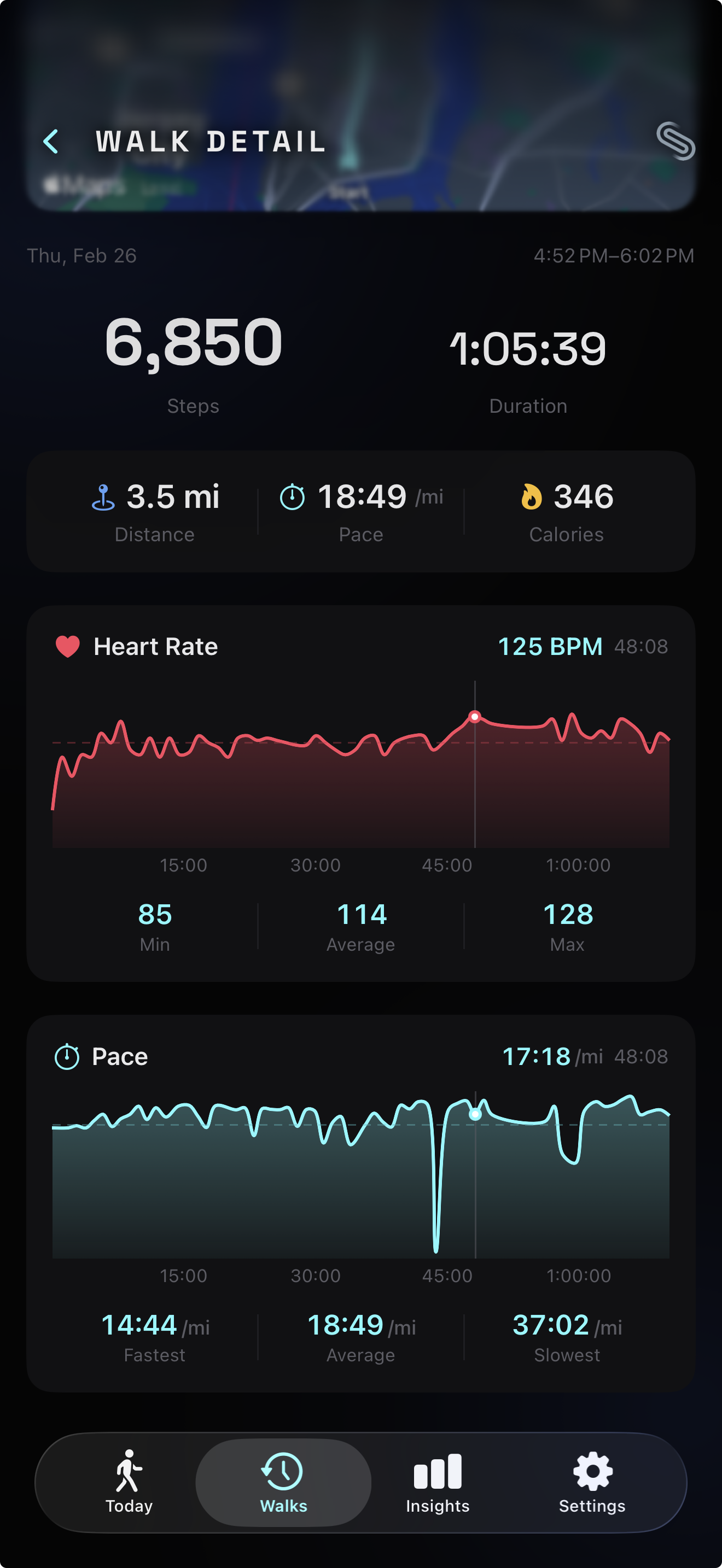
Last week we shipped a smooth live pace display — a calm, 5-second-rounded number that holds steady while you walk. That solved the live problem. But when you finish a walk and review your session, you don’t want a single number. You want to see how your pace evolved over 45 minutes. You want the hill at minute 12 and the stretch where you pushed harder at minute 30.
We already had this for heart rate — an interactive chart with a scrubber that lets you drag through your BPM timeline. The pace data was sitting right there in the session, unused. Adding a pace chart seemed straightforward: mirror the heart rate chart, plug in pace samples. Done.
Except pace data is fundamentally noisier than heart rate data, the Y-axis has to run backwards, and once you have two charts on the same screen, you need a way to correlate them. A 15-minute feature turned into a signal processing problem, a data visualization puzzle, and an interaction design challenge.
Why GPS pace is harder than heart rate
Heart rate data from a BLE chest strap arrives clean. Each sample is a single integer — 118 BPM, 122 BPM, 119 BPM. The sensor does its own filtering. The values are physiologically bounded (resting heart rate at the floor, max heart rate at the ceiling), and they change gradually. Plot the raw samples and you get a smooth, readable curve.
Pace data derived from GPS is a different beast. Witte and Wilson (2004) measured non-differential GPS speed accuracy in the Journal of Biomechanics and found that GPS-derived speed was within 0.2 m/s of true speed for only 45% of values. At walking pace — roughly 1.3 m/s — that 0.2 m/s error represents a 15% swing, enough to turn a steady 12:00/km into a jittery mess bouncing between 10:00 and 14:00. Their follow-up with WAAS-enabled GPS (2005) improved position accuracy tenfold but still only achieved speed accuracy within 0.2 m/s for 57% of values.
The physics explain why. GPS calculates speed from the change in position between fixes. Walking covers 1.2–1.5 meters per second. With a position error of ±15 meters on consumer devices, a single bad fix can make it look like you sped up by 10x or stopped entirely. Running at 3–4 m/s has a better signal-to-noise ratio simply because the signal (distance covered) is larger relative to the noise (position error). For walking, the noise can dominate the signal.
Biernacki (2023) tackled this problem directly in Sensors, measuring smartphone GNSS speed variance during steady runs and implementing cascaded IIR filters with accelerometer data. The software-level filtering reduced distance measurement error by roughly 70%. The takeaway: raw GNSS speed data from a phone is unusable for visualization without post-processing. You can’t just plot it the way you plot raw heart rate.
Smoothing the signal
Signal processing research offers well-established techniques for exactly this problem. We implemented a two-stage pipeline: a median filter followed by a moving average.
Stone (1995) compared median filtering against moving average and Savitzky-Golay filters for noisy signals in the Canadian Journal of Chemistry. The key finding: median filters outperform averaging filters for impulse noise — spikes — because they’re nonlinear. A single extreme outlier can’t pull the result as long as the number of corrupted entries is less than half the window size. Liquid Instruments puts it concisely in their application notes: “combining a linear and nonlinear filter in this way can effectively reject transients and reduce noise in many control or sensing applications.” Moving averages handle evenly distributed random noise; median filters handle spikes. Together, they cover both failure modes.
Stage 1: 5-point median filter. For each sample, we look at a window of 5 neighbors (the sample itself plus two on each side), sort them, and take the middle value. If four samples say 12:30/km and one GPS glitch says 8:00/km, the median returns 12:30. The spike is eliminated without affecting the surrounding values.
The choice of a 5-point window comes from the bias-variance tradeoff: wider windows remove more noise but also blur legitimate pace changes (like accelerating up a hill). With samples arriving roughly every 2–5 seconds from CMPedometer, a 5-point window covers approximately 10–25 seconds — enough to kill GPS spikes while preserving changes that happen over 30+ seconds, which is the timescale at which walking pace genuinely shifts.
Stage 2: 3-point moving average. After the median filter removes spikes, the remaining signal still has some roughness from sample-to-sample variation. A simple moving average of 3 adjacent values smooths this out. We use asymmetric averaging at the edges — the first and last points average with their single neighbor — to avoid boundary artifacts that plague naive implementations. As MATLAB’s signal processing documentation describes, median filtering “preserves edges while still smoothing signal levels,” while moving average handles general noise reduction — complementary strengths for a two-stage pipeline.
The two-stage approach outperforms either filter alone. A moving average applied to raw data would smear GPS spikes into broad bumps rather than eliminating them. A median filter alone removes spikes but leaves the curve looking stepped rather than smooth. Together: the median kills the noise, the average smooths the curve.
After smoothing, we clamp outliers (anything below 2:00/km or above 30:00/km), convert to the user’s preferred unit (minutes per kilometer or per mile), and downsample to 60 points using the same stride-based approach we use for heart rate charts — preserving the first and last samples for temporal accuracy.
Faster pace goes up
When you walk faster, does your pace go up or down? The answer depends on whether you’re thinking about speed (faster = higher number) or time-per-distance (faster = lower number). Pace is expressed as minutes per kilometer. A faster walker has a lower pace value — 10:00/km is faster than 14:00/km.
This creates a visualization dilemma. If you plot pace values on a standard Y-axis with lower values at the bottom and higher at the top, faster pace appears at the bottom of the chart. It’s counterintuitive. When you pushed hard on that hill, the line drops. When you slowed at a crosswalk, it rises. The visual metaphor fights the mental model.
The cognitive science is clear on why this feels wrong. Lakoff and Johnson (1980) established in Metaphors We Live By that “MORE IS UP” is not a mere convention — it’s an embodied metaphor grounded in physical experience (adding to a pile makes it taller, a thermometer rises with temperature). Tversky (2011) extended this to data visualization in Topics in Cognitive Science, showing that spatial metaphors like “up is more” and “up is good” are deeply embedded in how people read charts. Ratwani and Trafton (2008) tested this experimentally in Psychonomic Bulletin & Review, finding that people carry internalized structural expectations about how charts work — violating these expectations requires additional cognitive processing, slowing comprehension.
Cleveland and McGill’s landmark 1984 study in the Journal of the American Statistical Association established that “position along a common scale” is the most accurately perceived graphical encoding — more than length, angle, area, or color. When vertical position conflicts with the user’s mental model (higher should mean faster, but the numbers say otherwise), the most powerful encoding channel works against comprehension.
The fitness industry converged on the same solution. Strava Engineering (2013) documented their decision in a blog post titled “Pace Graphs — Up Is the New Down,” arguing that since heart rate and power charts both plot increasing intensity upward, pace should follow the same convention for visual consistency across data streams. Garmin forums show users arguing the same point: pace is intuitively synonymous with speed, so faster should sit higher. SportTracks eventually added a toggle after sustained user demand.
We implement this by negating pace values before plotting. A pace of 12:00/km becomes -12 on the Y-axis. The axis itself is hidden — no visible tick labels — so the negation is invisible to the user. They see a line that rises when they speed up and falls when they slow down. The Catmull-Rom interpolation smooths the visual curve through each point, and a dashed horizontal rule marks the average pace from the stat grid for reference.
Synced scrubbers
With a heart rate chart and a pace chart on the same screen, an obvious question emerges: “What was my heart rate when I was walking fastest?” To answer that, you need to correlate the two timelines.
We could have added a combined dual-axis chart — heart rate on the left Y-axis, pace on the right. But dual-axis charts are one of the most criticized patterns in data visualization. Stephen Few (2008) concluded he “cannot think of a situation that warrants them in light of other, better solutions.” The core problem: the two scales are independent, so the visual relationship between the lines is an artifact of the chosen axis ranges, not a real correlation. Isenberg et al. (2011) tested this empirically in IEEE Transactions on Visualization and Computer Graphics and found that superimposed dual-scale charts “performed poorly both in terms of accuracy and time.” As Datawrapper’s analysis summarizes: arbitrary scales mislead, proximity bias creates false relationships, and the solution is almost always to use separate charts.
Instead, we synced the scrubbers. Both charts share a single scrubElapsed binding — a TimeInterval representing the current position in the session timeline. When you drag across the heart rate chart, the pace chart’s scrubber follows. Drag the pace chart, and the heart rate scrubber follows. Both show the exact value at the same elapsed time.
This is the linked brushing technique from exploratory data analysis, first described by Becker and Cleveland (1987) in Technometrics. They introduced the concept of a mouse-controlled brush that, when moved over one scatterplot, simultaneously highlights corresponding points in all linked views. Roberts (2007) surveyed the field in his “State of the Art: Coordinated & Multiple Views” paper, describing how the technique matured from scatterplot matrices into a general principle: complex datasets require multiple views, each revealing different aspects, and coordinating their behavior expedites information seeking.
Baldonado, Woodruff, and Kuchinsky (2000) formalized design guidelines for multiple-view systems at AVI 2000, including the “diversity” guideline — use different visual encodings for different data attributes — and the “parsimony” guideline — don’t add views beyond what’s needed. Two stacked charts with linked scrubbers satisfy both: each metric gets its own encoding (BPM scale vs. pace scale), and the linking makes the pair more informative than either alone without adding a third, unnecessary view.
The implementation is lightweight. HeartRateChartView was modified to accept a @Binding var scrubElapsed: TimeInterval? instead of owning its own @State. Both charts write to the same binding through SwiftUI’s chartXSelection modifier, and both read from it for their overlay positioning. The parent view (WalkDetailView or SessionCompleteView) holds the shared state. When either chart produces a new scrub position, SwiftUI propagates it to the other.
Filling the gap at start
Pace computation requires distance to accumulate before producing meaningful values. Our cold-start threshold (100 meters and 30 seconds, as described in the smooth live pace display entry) means the first pace sample arrives 30–60 seconds into the walk. Without intervention, the chart would start with a visual gap — blank space from t=0 to the first sample.
Song and Szafir (2018) studied exactly this problem in IEEE Transactions on Visualization and Computer Graphics. They tested how different visual treatments of missing data affect user perception and found that breaking visual continuity — leaving gaps — decreases trust and can bias interpretation. Linear interpolation and forward-fill produced the highest user confidence and perceived data quality. Leaving gaps produced the lowest.
We fill the gap by projecting the first known pace value back to the session start. If the first sample arrives at t=45s with a pace of 12:30/km, we insert a synthetic point at t=0 with the same 12:30 value. This is essentially Last Observation Carried Forward (LOCF) applied in reverse — extending the first known value backward. The assumption — that your pace during the first 45 seconds was roughly similar to the first measured pace — is imperfect but visually superior to a chart that starts mid-session.
The 10-second threshold prevents projection for walks where the first sample appears quickly. If the gap is small enough that you wouldn’t notice it, we leave it alone. The projection only activates when the gap would be visually obvious.
Consistency between chart and stats
A subtle but important detail: the average pace shown in the chart’s stats row must match the average pace in the stat grid above. If the stat grid says 12:37/km and the chart says 12:41/km, users notice the discrepancy and lose trust in the data.
The discrepancy happens because there are two natural ways to compute average pace. One is to average all the pace samples — the arithmetic mean of every recorded pace value. The other is to compute it from session totals: total active duration divided by total distance. These produce different results because pace samples aren’t uniformly distributed in time. Early samples, when you’re warming up and walking slowly, are spaced differently from steady-state samples. Averaging the samples overweights periods that happened to produce more data points.
We use the session-total approach for both the stat grid and the chart’s “Average” value. The chart receives overallAvgPace — computed as activeDuration / distance in display units — and uses it directly for both the dashed reference line and the stat row. This guarantees the numbers agree, because they’re the same number.
McKinley, Pandey, and Ottley (2025) studied visualization trust at CHI ‘25 and found that users apply internally consistent frameworks for evaluating trustworthiness — clear, readable designs and consistent visual language build trust across the widest range of viewers. Franconeri et al. (2021) reinforced this in Psychological Science in the Public Interest, reviewing decades of research showing that poorly designed displays with inconsistent mappings between data and representation lead to misperceptions. When your stat grid and your chart agree, the user trusts both. When they disagree, the user trusts neither.
Performance under scrub
Both charts use the same performance pattern we established for the heart rate chart: the chart body is wrapped in an Equatable struct (StaticPaceChart) that only re-renders when the underlying data changes. During scrubbing, the expensive chart path stays frozen — only the lightweight scrubber overlay (a line, a dot, and a text label) updates per frame. Apple’s Demystify SwiftUI Performance (WWDC23) explains why this matters: SwiftUI only re-evaluates a view body when a tracked dependency changes, so isolating gesture state from rendering state is critical for interactive charts.
This matters more with two charts than one. Without the Equatable guard, scrubbing would trigger re-renders in both charts simultaneously — the one you’re touching and the one following via the shared binding. That’s twice the rendering cost on every frame of a drag gesture. The Equatable pattern reduces it to two overlay updates, which is cheap enough to maintain 60fps on all supported devices.
The result
The walk detail and session recap now show pace as a story, not just a number. You can see where you sped up on a flat stretch, where the hill slowed you down, where you found your rhythm. Drag across the pace chart and the heart rate chart follows — showing you the cardiovascular cost of that pace change. The signal processing pipeline turns noisy GPS data into a smooth, readable curve. The reversed Y-axis means “up” always means “better.”
What we learned
Building the pace chart reinforced a principle we keep encountering: the distance between “I have the data” and “I can show the data” is almost always longer than expected. Raw GPS pace data exists — it’s recorded every few seconds during every walk. But between the raw samples and a chart worth looking at, there’s a pipeline: outlier removal, median filtering, smoothing, unit conversion, downsampling, axis inversion, gap filling, and consistency checks. Each stage solves a specific problem, and skipping any one of them produces a chart that’s subtly wrong.
The synced scrubber was the most rewarding part. Two charts, each useful on their own, become significantly more useful when linked. You stop seeing heart rate and pace as independent metrics and start seeing them as two perspectives on the same walk. That’s the promise of coordinated multiple views in information visualization — a technique well-studied in research but still underused in consumer apps. Most fitness apps show metrics in isolation. Linking them reveals the relationships that make the data interesting.